 aving spent relatively satisfactory spring and summer terms, I came back to the fall semester of 1997 with an unusual sense of optimism and energy.
As the focus of this page, the graduate Arch. 201 studio for this semester, led by Roddy Creedon, allowed me to produce what I feel to be my best student work-- a set of planning and architectural development guidelines for the desolate, polluted, and decaying industrial Mission Bay area south of downtown San Francisco.
For all our differences over the years while I was an undergraduate, I actually appreciated this term with Roddy, since he actively encouraged out of the box thinking.
All the typical studio horseplay notwithstanding, it was quite an intellectually stimulating environment.
I became a sort of an anti-architecture architect.
I was obsessed with the romance of nature, ecological sustainability, wetlands, fields, horizontality, and most of all, all things Dutch.
 he formidable expanse is dominated by Union Pacific's abandoned railroad yards, large warehouses, docks, and brownfields.
However, the area's potential is undeniable.
It's just south of PacBell Park in China Basin, and it's also adjacent to Potrero and South of Market districts.
San Francisco shortage of housing is legendary, and the lack of green, open spaces near downtown neighbourhoods is deplorable.
For us in the studio, this area represented an unprecedented opportunity to mitigate these longstanding problems.
In 1997, the Mission Bay area was San Francisco's largest undeveloped area, and Catellus (the development arm of Union Pacific which owned most of the land) had been given the right to turn the whole area into a mixed-use area that would also incorporate a new research campus for UCSF.
The studio's aim was to explore and generate alternative proposals for Mission Bay.
The studio consisted of three phases: drawing up codes and design guidelines for Mission Bay; develop a master plan (with land use designations) that would compliment our new design guidelines;
and the architectural design of an integral programmatic component of the master plan.
For my alternative design guidelines for Mission Bay, I ostensibly proposed a rather conventional New Urbanist strategy with emphasis on ecologically sensitive, built environments oriented by transit and pedestrian activities.
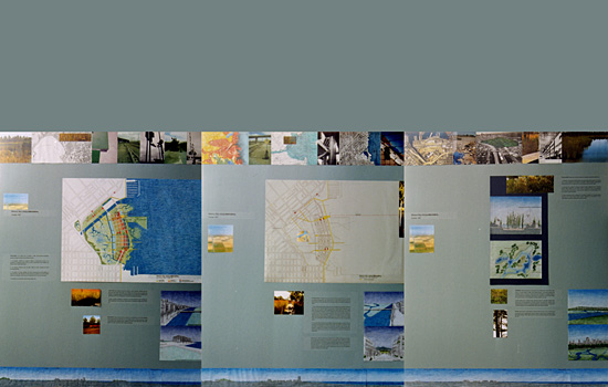
For the master plan (presentation boards shown below), I called for a sustainable, ecologically-sensitive approach that set aside more than half of the site for the restoration of wetlands which dominated the area well over a century ago.
An additional significant portion of the site would be reserved for recreational use. Bringing nature into the forefront of an urban environment, the scheme sought to balance the restoration of wetlands as well as the provision of new housing and institutional developments with guidelines based primarily on ecological concerns and on the principles of transit-oriented development.
It was almost a rebuke to architecture and the built environment.
I wanted as least architecture as possible.
The final phase of the studio was the design of the ferry terminal and market, one of the central features of the master plan.

 owever, like the ominous clouds of Vietnam which gradually started to gather during the incredibly ambitious and optimistic period of early LBJ administration's Great Society, the then-unforeseen problems entailed in formulating and developing my forthcoming thesis project would darken and eventually drag down virtually every aspect of my life, including this studio.
(Indulge me a bit, and let me be a drama queen for a moment.)
By the end of the fall 1997 term, most of my time was spent researching for, working on, and preparing an already troubled forthcoming thesis project (which did not officially begin until January 1998) while I should have been devoting badly-needed time and creative energies to this studio and other neglected classes.
Reflecting the interminable length and the debilitating casualties (of every sort) of the Vietnam War, my thesis project would eventually drag on for years (until spring 1999 to be exact) at a tremedous cost to my self-esteem as well as mental health.
While it wasn't as emotionally painful as the relationship troubles in my personal life of the mid 1990s, I wouldn't be exaggerating when I say that in the long run, graduate thesis was the most difficult and humiliating experience in my entire life.
It was the first time when I felt seriously defeated in the academic as well as creative sense.
It's still something I'm recovering from.


November-December 1997
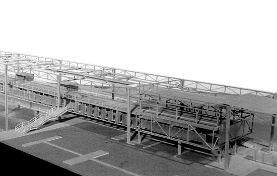
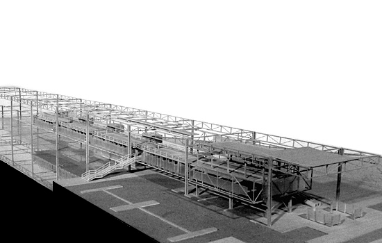
 he 1/16" scale model shown here was originally produced for a five-week Arch. 201 design project (the third and final phase of the design studio) that would anchor the aforementioned comprehensive master plan developed for Mission Bay of San Francisco.
The project consisted of a public market and a ferry terminal complex which would serve as the activity centre of the proposed, master-planned, transit-oriented community built on the edge of the restored wetlands area.
Keeping with the principles of transit-oriented development, the complex attempted to integrate transit with various retail, commercial, public market, entertainment, and community facilities while incorporating outdoor public spaces that interacted with the waterfront. Several terraces allow visitors to hang out and enjoy views of the nearby city skyline as well as the San Francisco Bay.
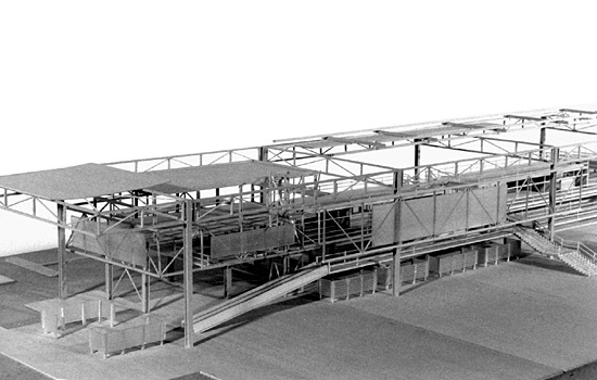
Similar to a pier, the project's form consisted of a simple steel superstructure that acted as a framework from which various programmatic elements rested.
Public markets facilities were placed on the ground level while various retail and entertainment facilities occupied the upper ferry terminal level.
 This is the view of almost the entire model from the south side. I don't think an image of the entire model exists.
Needless to day, photographing this project was a real bitch due to its length.
(Click image for enlarged, non-cropped version.)
|
 A view of the project's north side. Note the vertical shading devices.
|
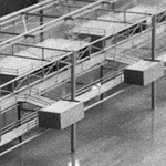 A view of the prefabricated toilet units craned and installed into the superstructural framework.
|
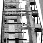 View of the project projecting into the San Francisco Bay.
|
 ere's a perspective view from the northwest of almost the entire model (1/16" scale and over 5 feet long), showing the steel superstructure supporting all the programmatic components of the complex.
Ferry boats would dock on the far side of the pier structure.

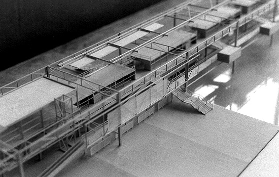
 ere's a perspective view from the southwest.
The public market stalls would be on the ground level while retail and entertainment facilities would occupy the terminal (upper) level. Ferry passengers would pass through a variety of shopping, dining, and entertainment options while embarking on or dissembarking from their ferry journeys.

 ere's a somewhat detailed view from the north side of the complex where the carpark (foreground) would be located.
Farmers and vendors could park their vehicles beneath the terminal (upper) level shops so that goods and produce could be easily loaded or unloaded and moved directly into or out of the public market on the same level.
The vertical planes on the upper level were shading devices designed for protection against the low, late afternoon sun.
