 his is another Buffalo Design library project that is every similar in scope to the Monroe Library.
However, it serves a very diverse urban community in Seattle, and its site is tight and surrounded by cranky neighbours.
Fortunately for assembling my portfolio, I also got the chance to contruct a nice basswood model for it. It was actually rather nice to feel like I was doing one of my old school projects again.

Winter 2002 - Winter 2005
 his is what happens when you have a very vocal, vigilant, opinionated, and often-combative neighbours, who are afraid that the architects would try to compromise what they deemed to be the delicate character and scale of this quasi-suburban north Seattle community.
Built over a covered garage, this 15,000 sq. ft. Seattle Public branch library replaces an outdated modernist structure on the same site from the early 1950s, while doubling its size and increasing the scope of the programme with the addition of a community meeting hall.
The form, scale, and tectonics were pretty much determined by input from Greenwood residents, various Greenwood architectural traditions and motifs, lighting and energy considerations, and Seattle zoning and building codes.
The massing of the library also addresses the differences in scale, as well as in the elevation between the single-family residential neighbourhood on the east side of the building and the busy commercial thoroughfare on the west.
On the Greenwood Avenue side, the library’s community meeting hall becomes a visible storefront that blends into the modest scale and character of the traditional commercial strip.
What started out as a much more ambitious scheme that featured green roof and other sustainable design components, the final design unfortunately abandoned them due to cost constraints (and possibly short-sightedness on the part of the Library).
The community essentially got what they had asked for, and they certainly would not have settled for anything less.
I took on this project from schematic design onward while working closely again with my glamourous Buffalo Design principals and colleagues Chris Carlson, Lisa Roberts, and Lisa Scribante.
Incidentally, the site plan provided by the landscape architect nicely supports the project's concept. Click on the site plan drawing below to examine in detail.
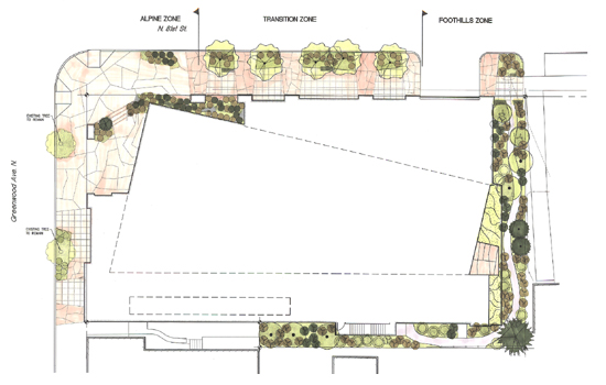
 hy don't we get the drawings out of the way get get our bearings on this project? Here are the basics provided below, drawn by yours truly.
 Floor plan of the main level of the library is provided here, if you're into that sort of thing. (Click image for enlarged, non-cropped version.)
|
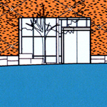 North and west elevation presentation drawings of the building.
|
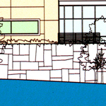 South and east elevation presentation drawings of the building.
|
 ere's a view of the north elevation, featuring the parking garage entry below the piano nobile.
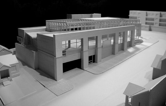
 ere's a view of the east elevation with a nice balcony.
And yes, this seemingly modest building occupied most of my professional life for nearly two years.
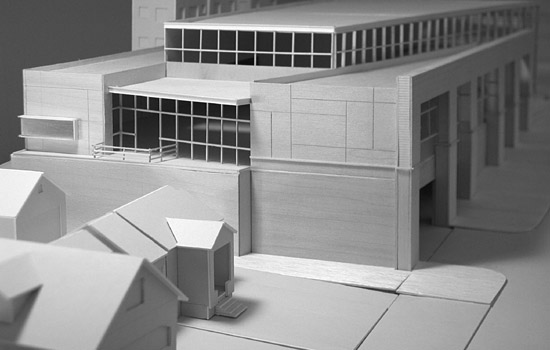
 nother view of the east elevation balcony and the corner window of the study room on the south side of the building.
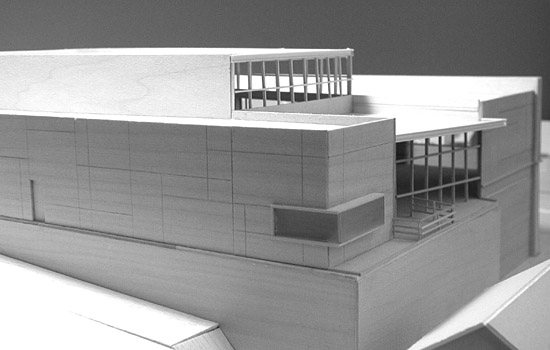
 elow is a closer view of the entry canopy and the display case on the west side of the building facing Greenwood Avenue. The entry procession is actually one of the few relatively sexy moments of the project. The aesthetic countenance of the entire library is admittedly so conservative and modest that you can easily miss it when you drive by it in a motor vehicle. For better or worse, that's what the most vocal of the library's neighbours wanted-- an unobtrusive and (slightly) boring building to blend into the (very) boring neighbourhood. And that's what they got.
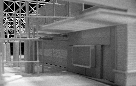
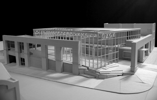
 id you know that Greenwood is the largest branch in the Seattle Public Library system, except for that one downtown designed by some guy named Rem Koolhaas? Anyway, here are more model pics of our absolutely humongous bibliothèque:
 Another view of model from the northwest, this time with the roof removed to expose the trusses inside.
|
 Perspective of the children's library and the main entry at the northwest corner of the building.
|
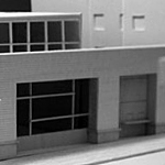 Perspective of the northwest corner of the building.
|
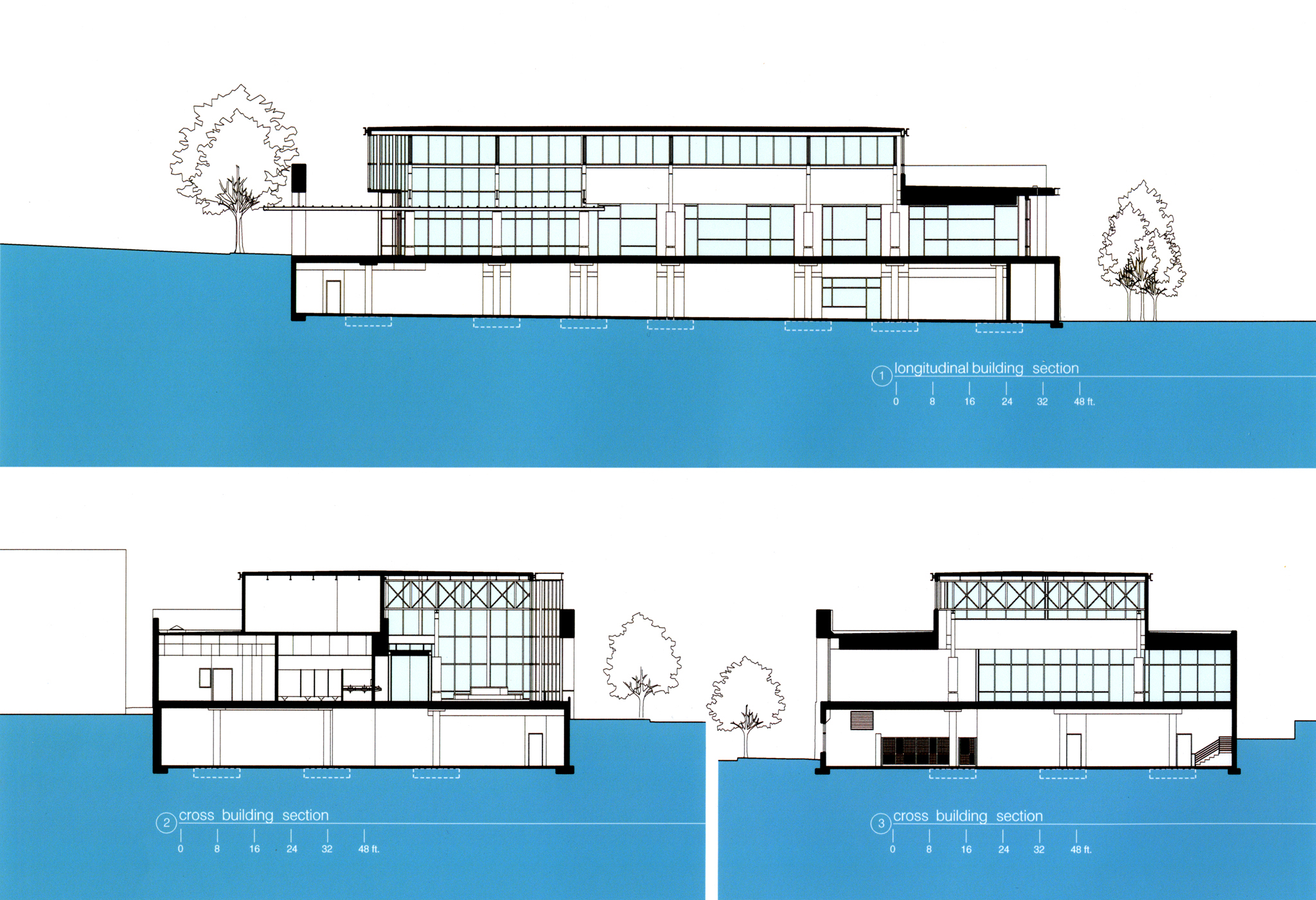
 inally, we have one more presentation drawing to examine before we move on to tour the built results, and it's the building cross and longitudinal sections (click to enlarge).
